The SeaHouse ~ Written by Lucy Owen, Illustrated by Rebecca Harry. Published by Firefly Press.
The Seahouse is due to be published in just under a week and Lucy Owen and I are very excited! I thought you may like to know a bit about the illustrations and how the pictures in the book came about.
When Firefly Press sent me Lucy’s lovely text, images instantly came into my head. I had to doodle them quickly before they disappeared! The idea of a house being underwater was so magical!!
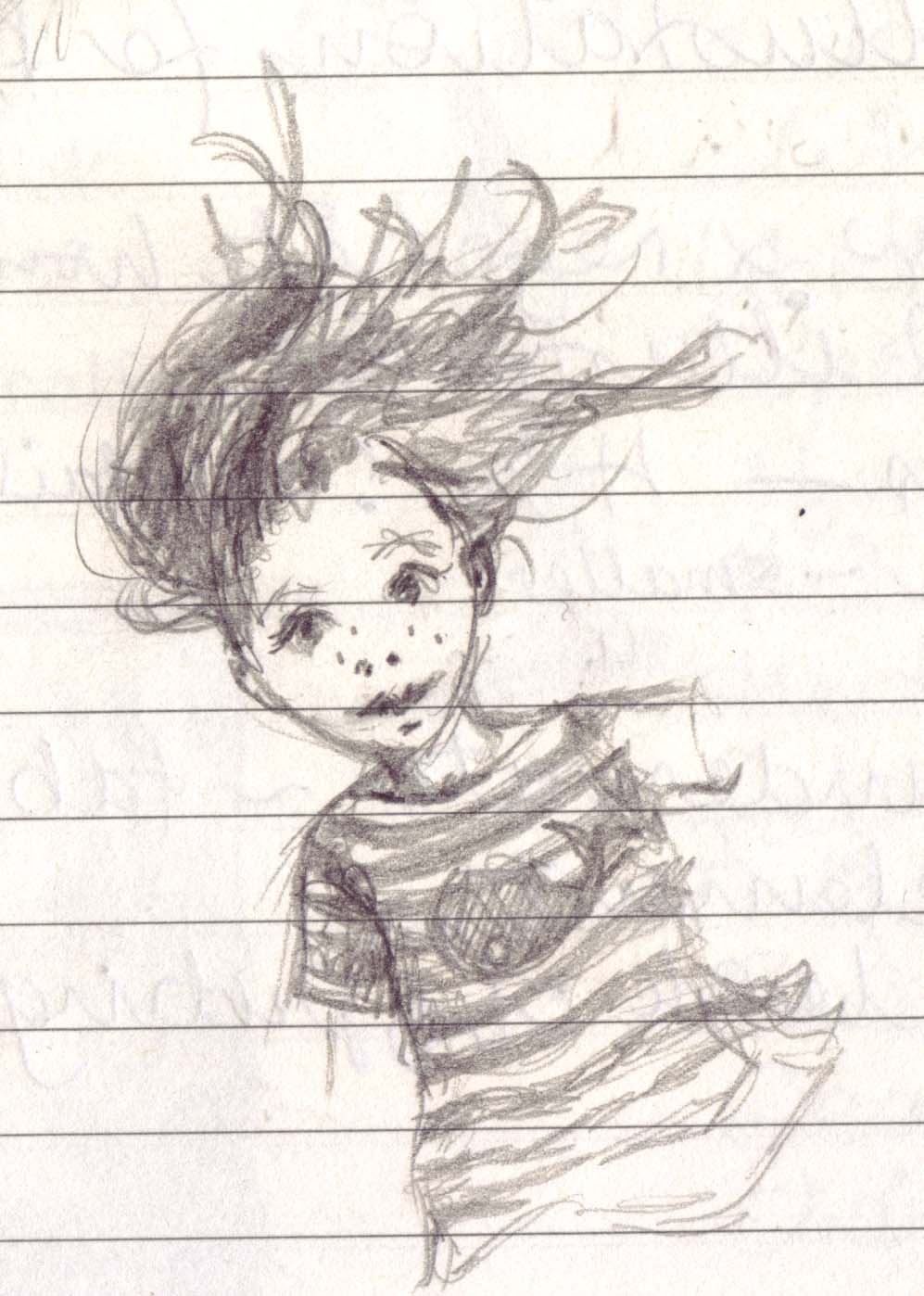
The central character is a young girl called Coral. She was strong but was going through a tough, emotional time. I had to decide what she looked like first and foremost.
The immediate image came to me when I was out and about and only had a lined note book to hand! These are the early sketches of Coral….
The story starts when Coral wakes up in bed. Because of this, I put her in a long stripey t-shirt. This would look like a nightdress but also double up as a kind of Summer dress for the rest of the book as she is swimming around.
Next I tried her in colour in a watery environment…..
Coral was coming along nicely, Firefly and I agreed that we just needed to make her look a bit older.
Next was Coral’s new little friend ~ Fabulous the fish. This is the first drawing I did of Fabulous ……
She is a very tiny fish in comparison to Coral and the rest of the creatures, so it was hard to show a lot of detail on her. I would like to have kept her this big so you can see her up close!! :)
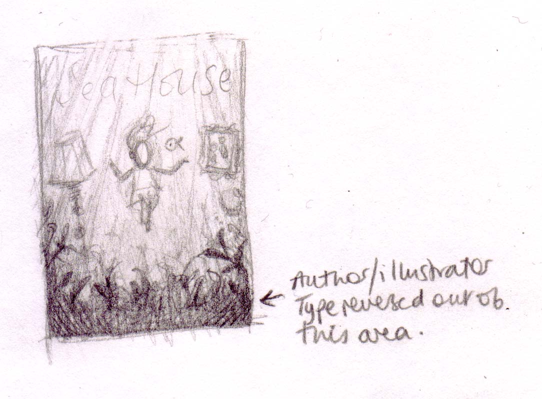
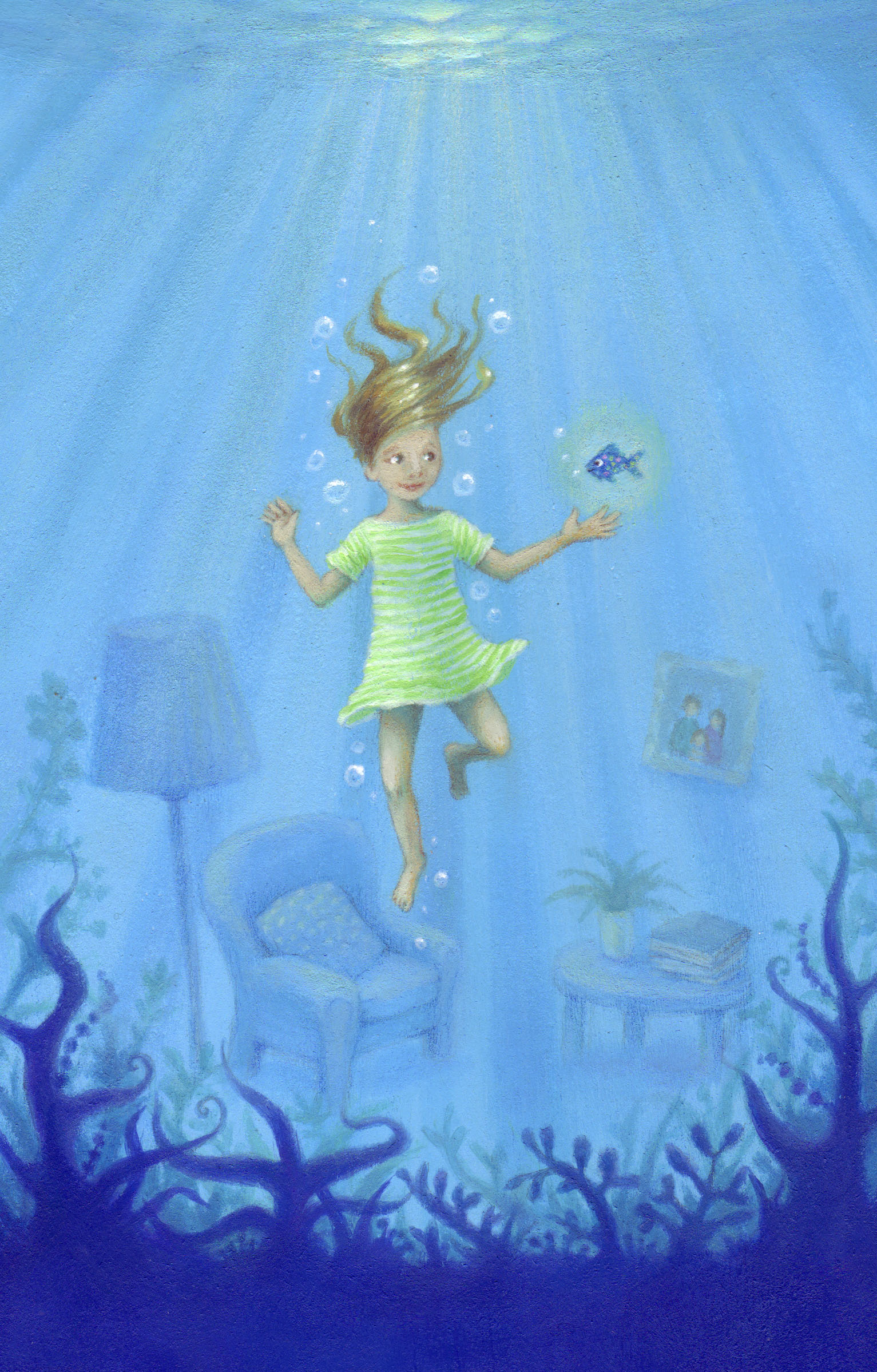
The cover was the first completed image I did for this book. Normally I do the cover last if I’m illustrating a picture book but this was a reading book where the cover is usually the main artwork. It was very important for me to get it right as this determined the feel of the book and also the exact look of Coral.
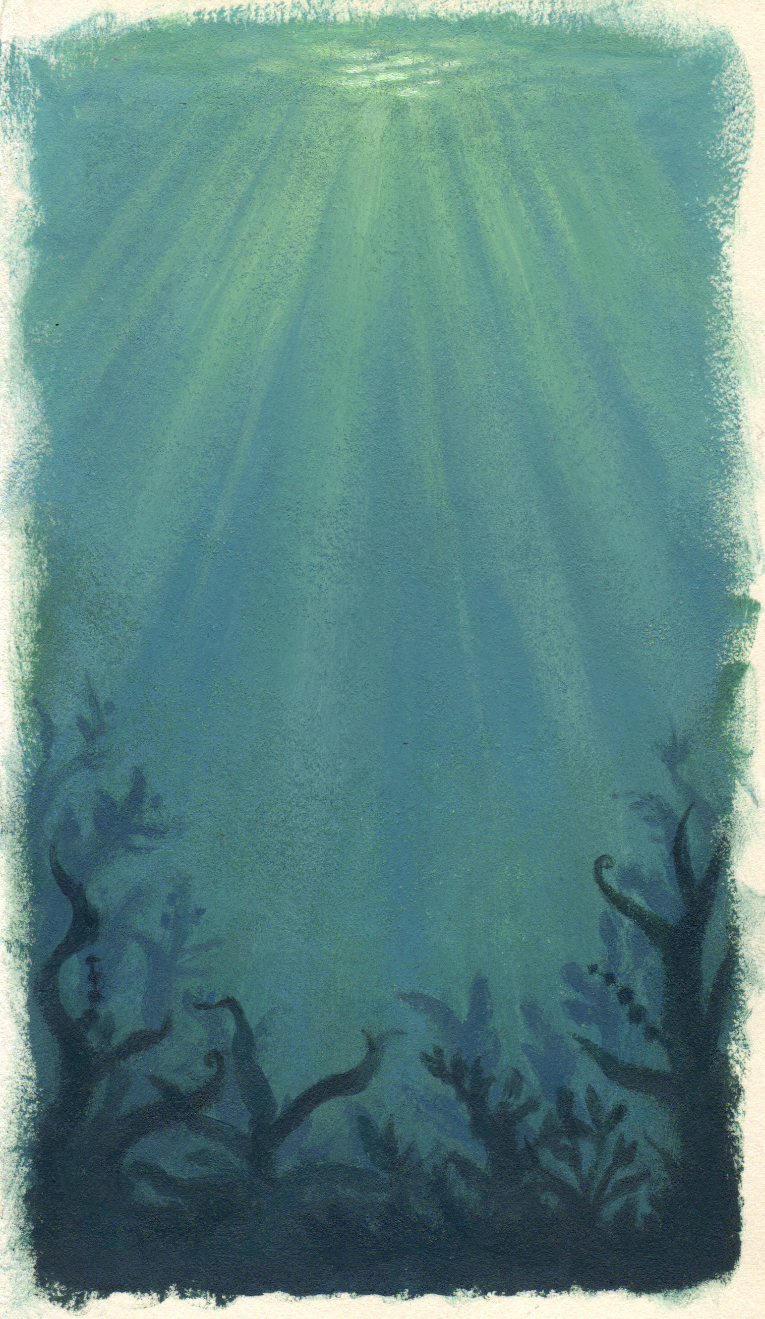
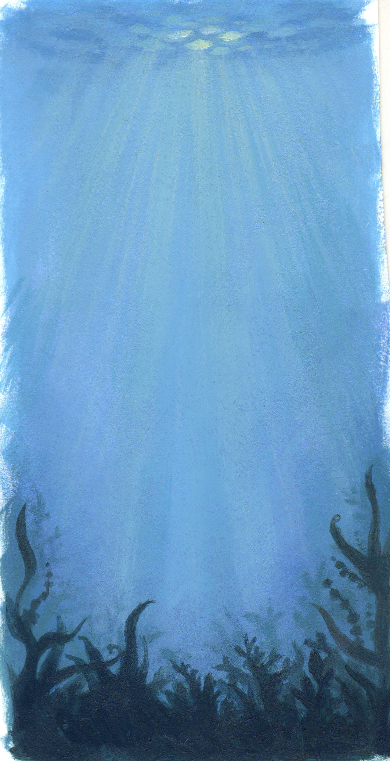
I drew a tiny thumbnail idea of it and tried out some colour backgrounds….
Firefly chose the blue background, then I took a deep breath and started the artwork. I didn’t want to make any mistakes with the detail on Coral’s face and I wanted the water to look nice and transparent. This is what I did…
Original SeaHouse cover art.
I needed to make Coral and Fabulous look comfortable and happy underwater but the sinister looking seaweed at the bottom implied a darker side to the story.
It was decided that Coral wasn’t quite prominent enough though so the designer, Claire Brisley cleverly tweaked my cover artwork and enlarged her so that she now sits more prominently beneath the title.
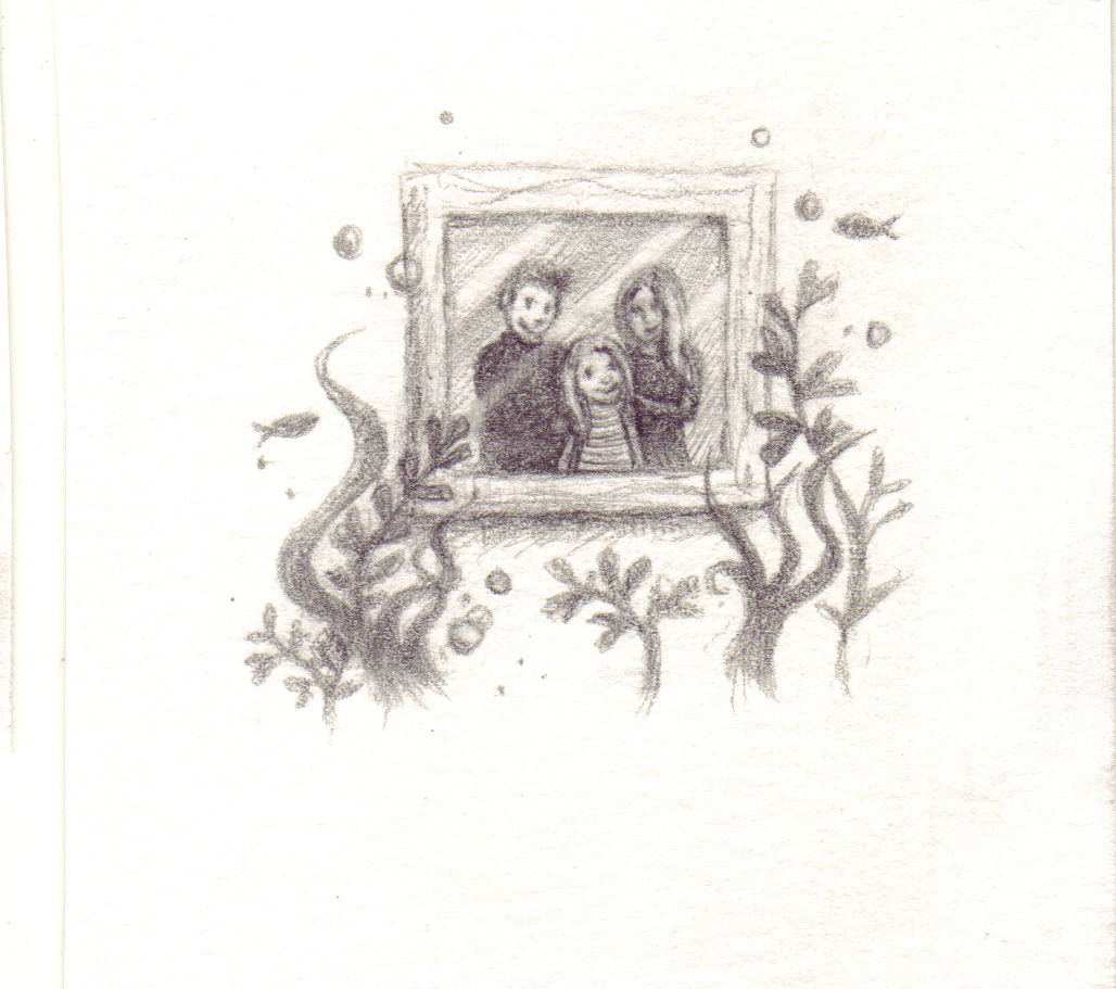
Next I designed the illustrations inside the book. These had to be in black and white because they were to be printed with the black and white text. I could have done these in many different ways: paint, collage, ink, but I decided to create them using graphite pencil. This allowed me to make the images with the same amount of detail and softness as the cover.
I then immersed myself in The SeaHouse …
and enjoyed every minute creating the underwater drawings….
This is one of the chapter headers for the SeaHouse.
Chapter headers are nice and decorative and help to break up pages and pages of text. I had to think of something that summarised each chapter and then create a little image for that title. I really loved doing these.
Here are some more….
Chapter headers.
The most difficult thing?? This was keeping Coral looking the same throughout the book…
When Coral met Fabulous.
But I had no problems with ideas as I felt very inspired by this lovely underwater world that Lucy had written about…
The naturalist Iolo Williams gave us a lovely review of the SeaHouse. Thank you Iolo!
“The Sea House is a wonderful book, beautifully written with stunning illustrations. It brings the marine world literally into our living rooms and I sincerely hope it helps to awaken a respect and understanding of the marine environment in its readers, young and old alike.”
— Iolo Williams, naturalist and broadcaster.
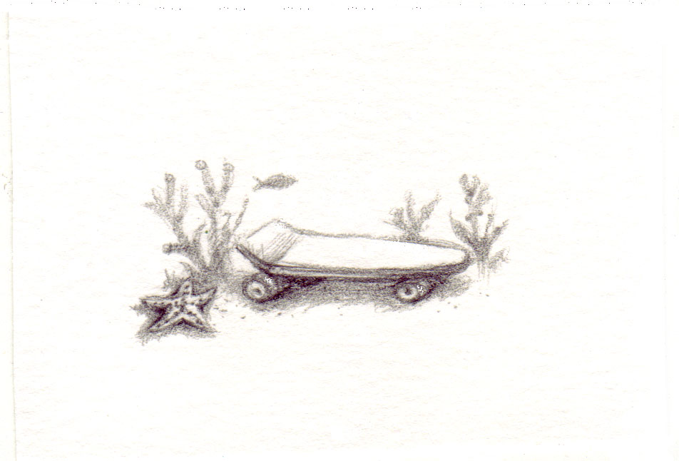
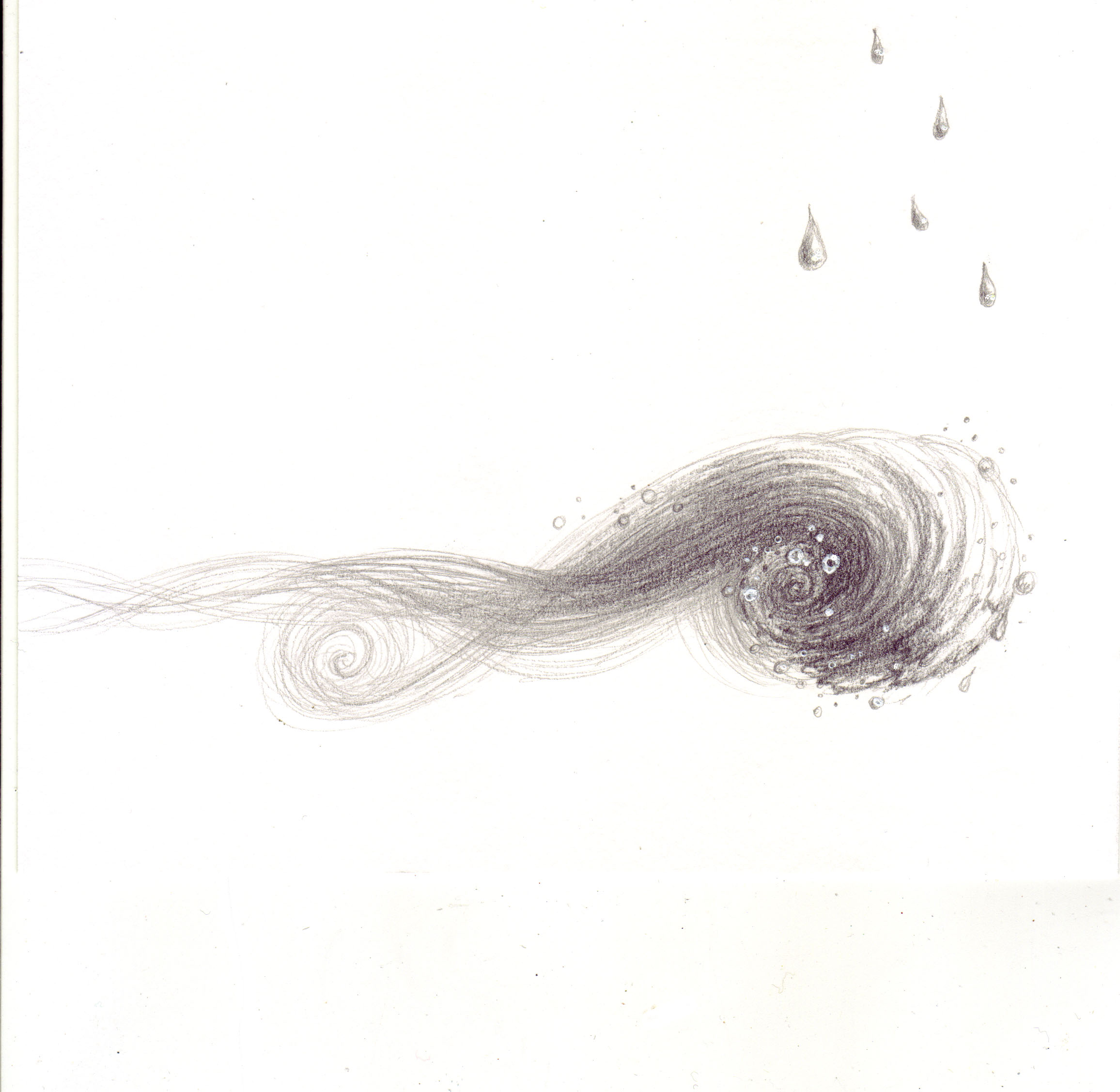
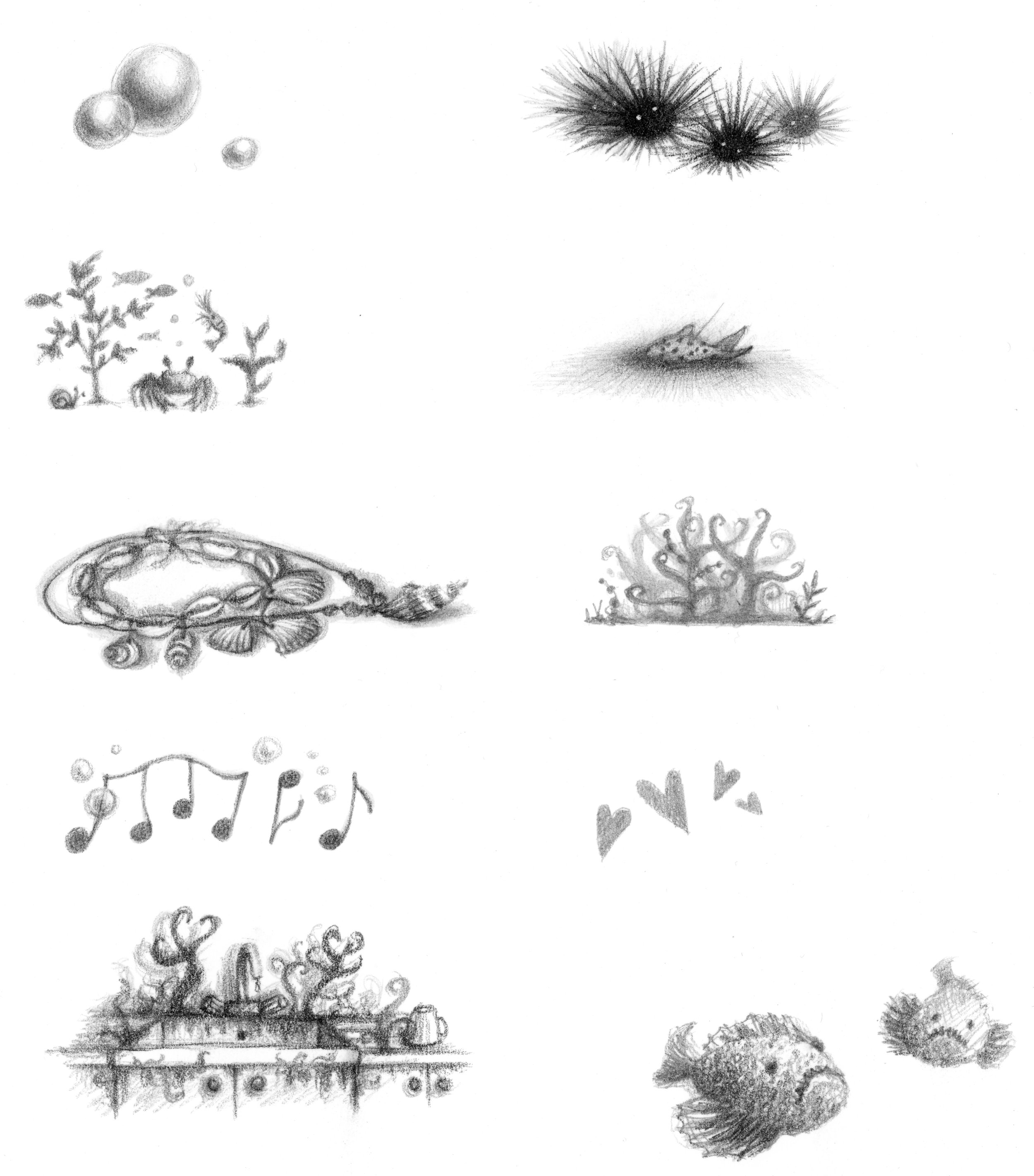
Below are some tiny illustrations that weren’t used …..
These would have gone around the page numbers but we didn’t need them in the end. I still loved making them and they were good practice for the other pieces!
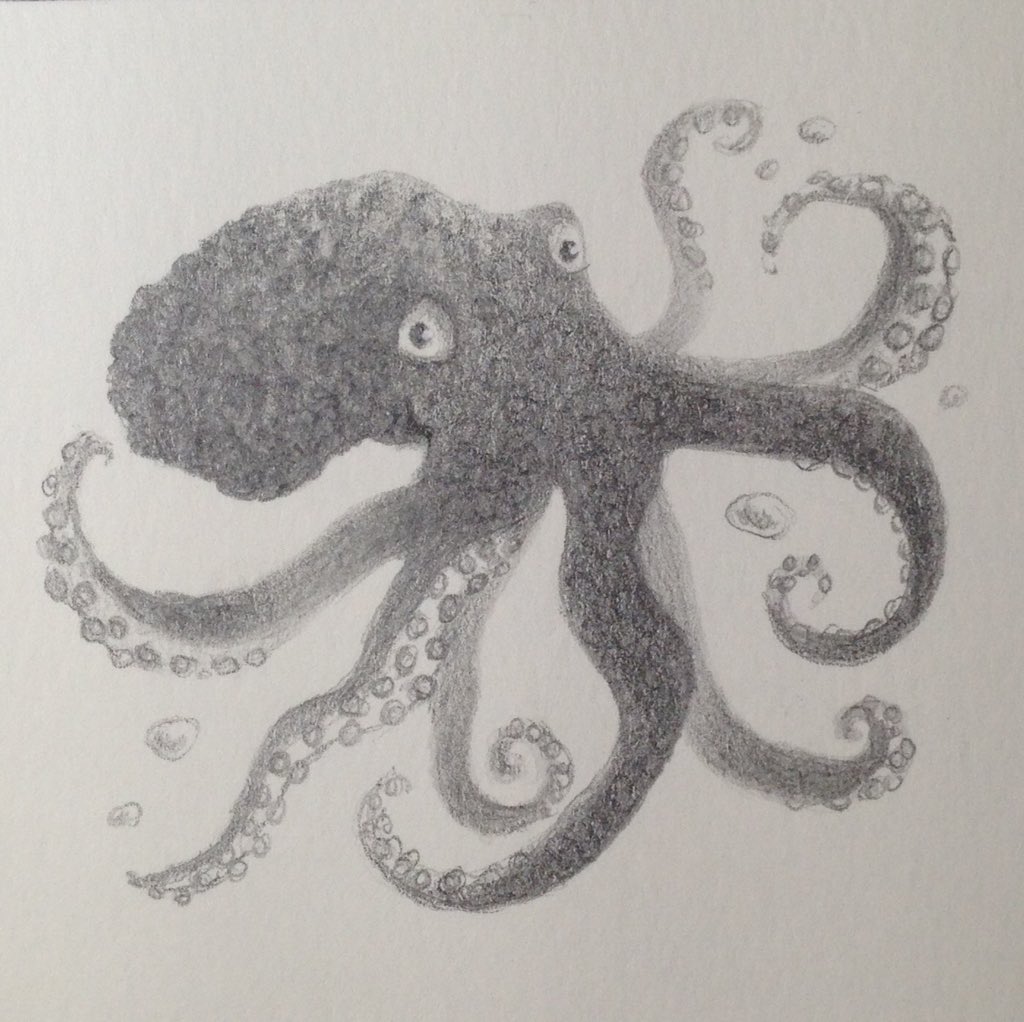
Dotted throughout the book are some larger illustrations that break up the text for the young reader…
Dr. Sweetlips trying to save little Fabulous.
There are several of these larger pieces throughout The SeaHouse.
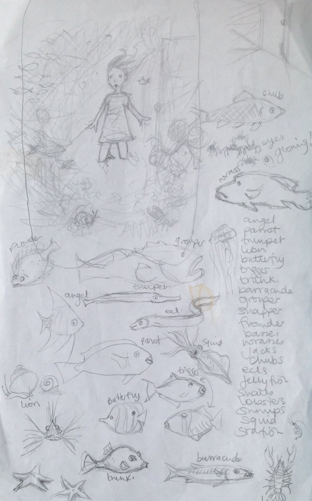
Some of the fish that Lucy listed in her text sounded amazing!! I knew exactly what some species looked like, but there were lots that I didn’t know. I needed to do some research. So I watched some underwater films of these fish and some LIVE CAM aquarium footage from America. It was very dreamy and enjoyable to watch and I did some quick doodles as they moved around in the water. Here are my quick doodles….
Trunk Fish
Trumpet Fish
Triggerfish
Snapper
Wrasse
Butterfly Fish! ….
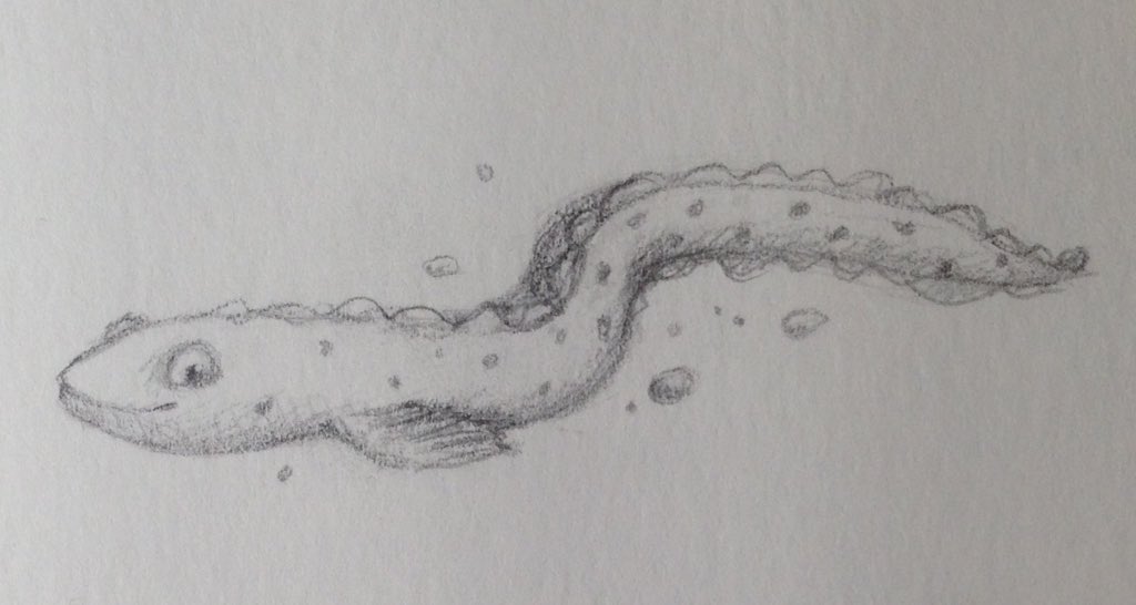
At the end of the book, Lucy wrote some Fabulous Fish facts about real creatures in the ocean. We need to look after our planet and our oceans and this little fact file helps us learn about some of the species that live there. We can build up our understanding of all creatures and that will help us to respect and protect them.
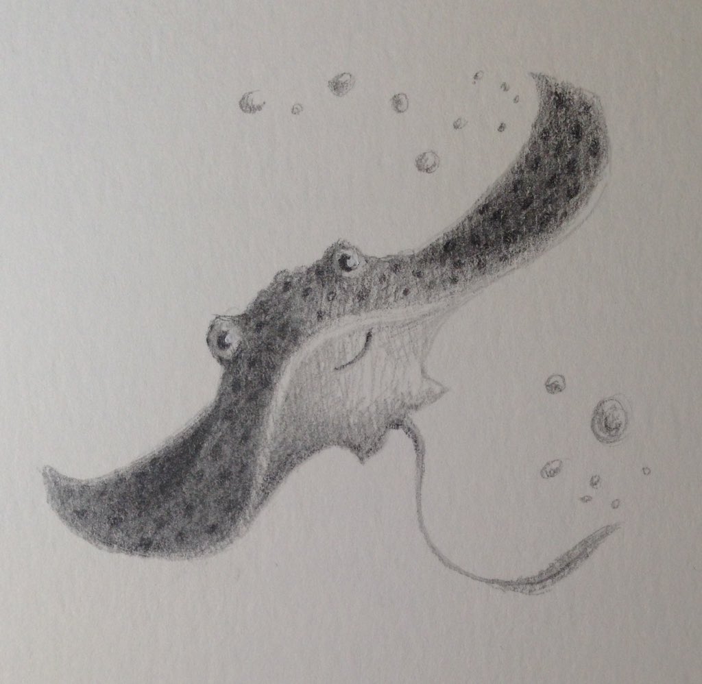
Here are some of the Fish Facts illustrations…
Stingrays in real life aren’t as bad as our villain Stealth. I enjoyed making this one friendly.
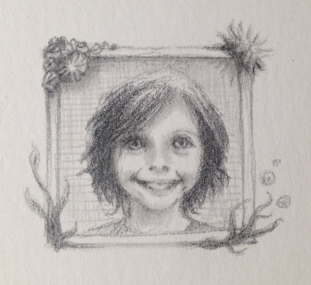
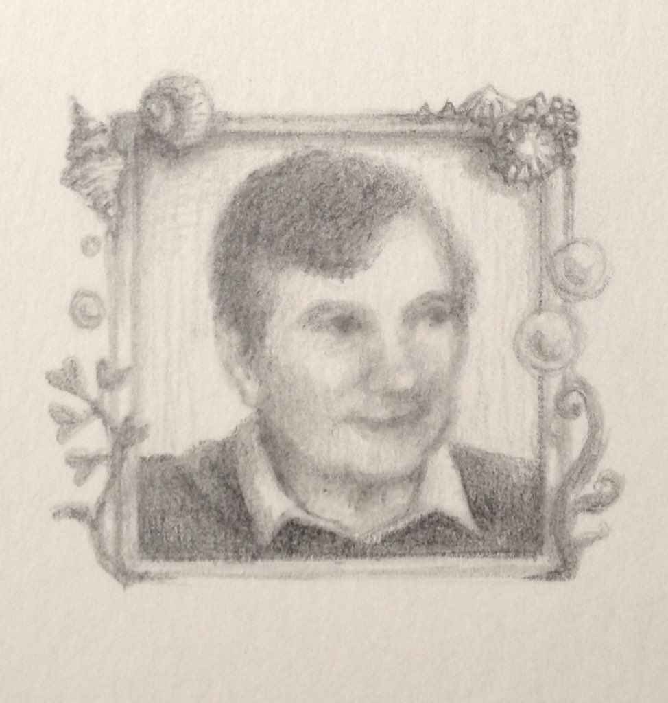
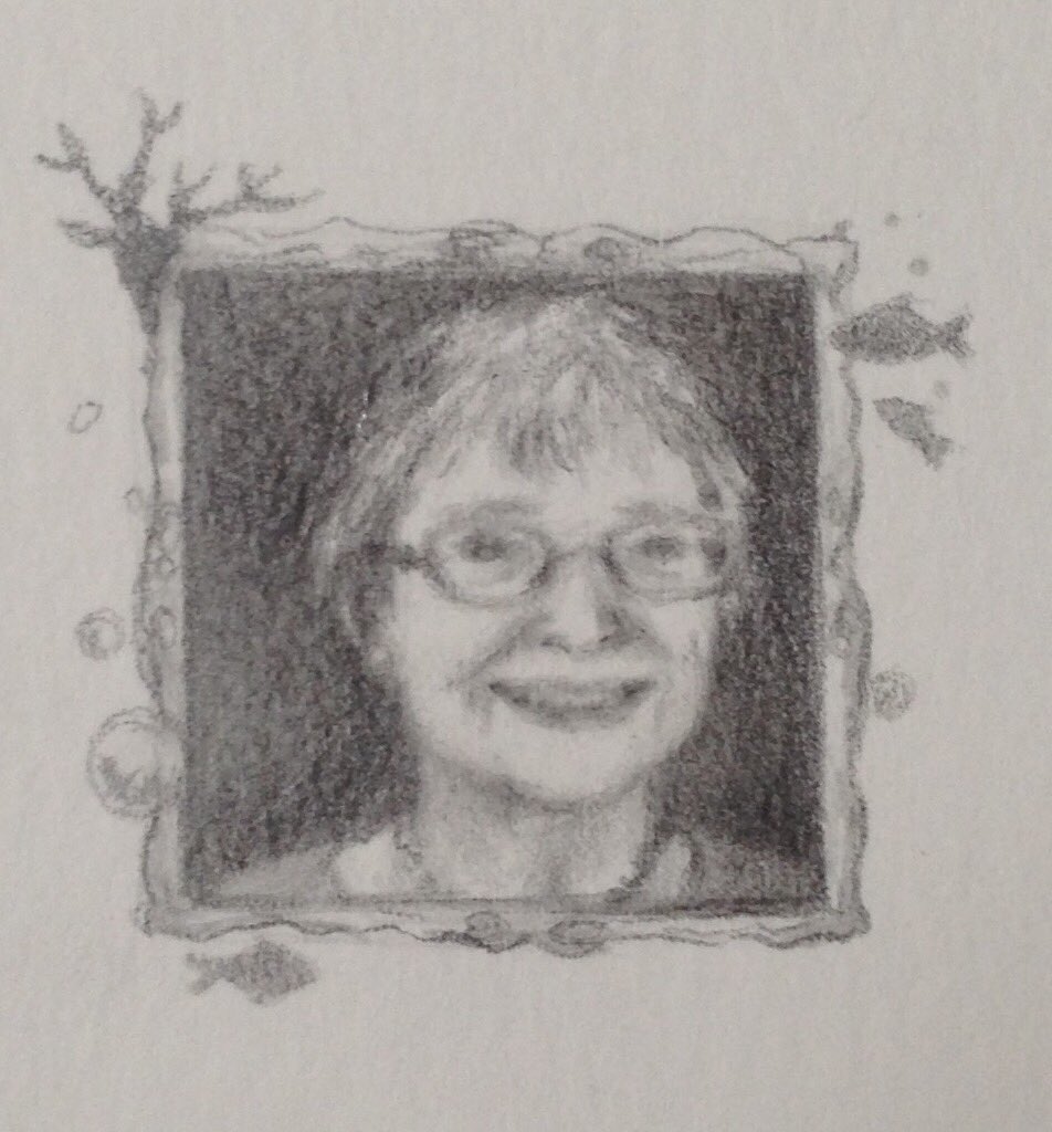
One lovely thing about having a book published is that you can dedicate it to someone special. A last little idea I had for the book was to draw portraits of the people that Lucy and I were dedicating the SeaHouse to…..
For Gabriel, Jeff and Denny xxx
Lucy and I are so excited about the release of the SeaHouse on April 11th 2019! We can’t wait to hear what you think about it. Please let us know on Twitter using the following:-
@BekHarry1
@LucyOwenWales
@FireflyPress
You can buy the book from the fabulous Firefly Press here:-
www.fireflypress.co.uk/product/the-sea-house
Thank you for reading my blog today. I hope you enjoyed it. If you did, please click “Like” below.


